Enhanced Checkouts
Enhanced Checkouts
Redefining a digital sales platform that provides agents with the ability to sell local moving services directly.
Redefining a digital sales platform that provides agents with the ability to sell local moving services directly.
ROLE
ROLE
Lead product designer
Lead product designer
DESIGN DURATION
DESIGN DURATION
8 weeks
8 weeks
READ TIME
READ TIME
5 minutes
5 minutes


APPROACH
APPROACH

Table of contents
Table of contents
Table of contents
IDENTIFY
PROBLEM
PROBLEM
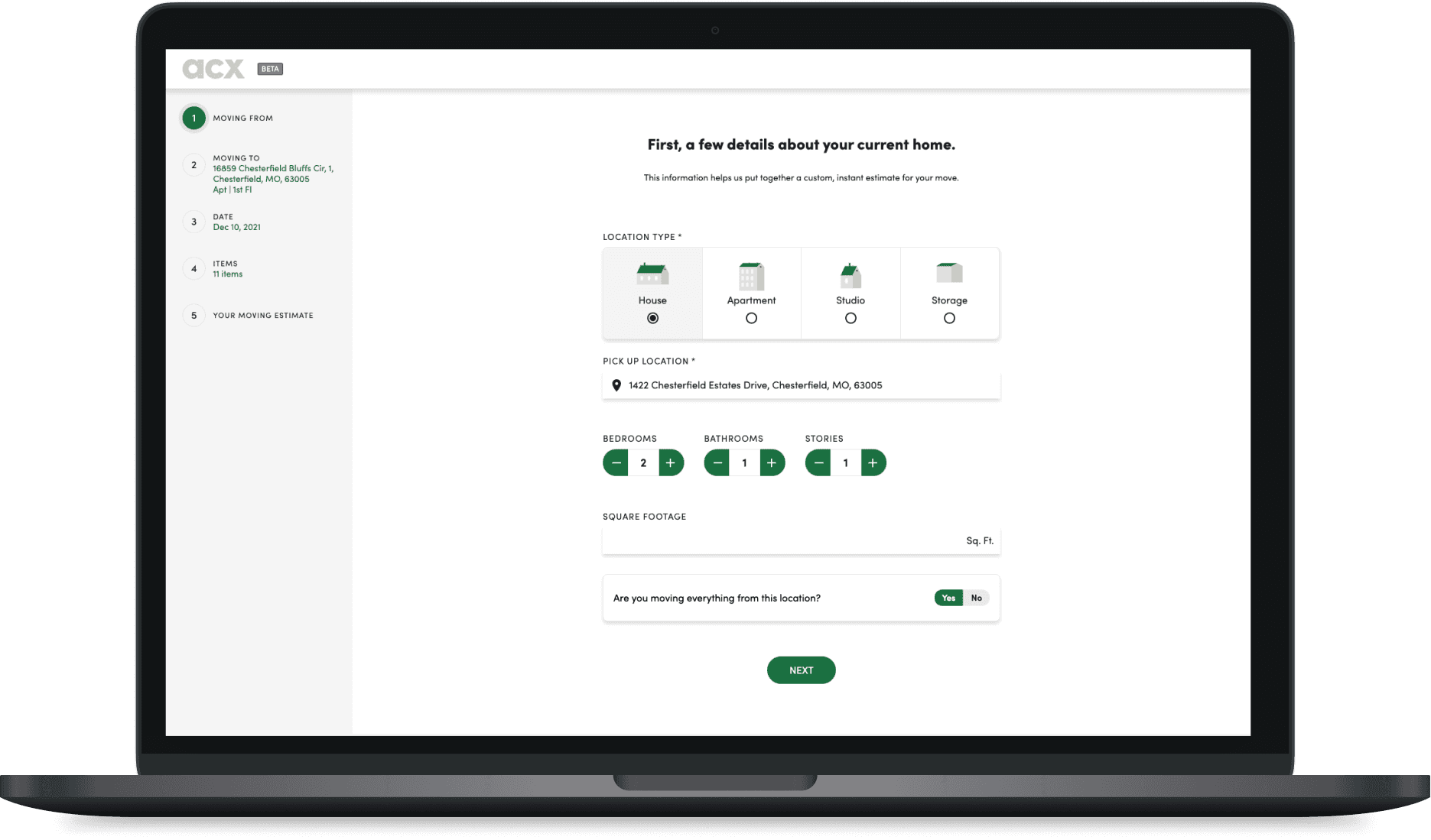
We were noticing a significantly high drop off rate of 78% when we asked customers to fill out pertinent information that would help us estimate a quote for their move. By dropping off or adding inaccurate data due to a poor experience, we were seeing less accurate pricing estimates.
We were noticing a significantly high drop off rate of 78% when we asked customers to fill out pertinent information that would help us estimate a quote for their move. By dropping off or adding inaccurate data due to a poor experience, we were seeing less accurate pricing estimates.
HYPOTHESIS
HYPOTHESIS
Hubspot has over 17,000+ daily users uploading attachments to their record pages. Over 1200 customers have voiced their frustrations about the current experience using attachments.
Hubspot has over 17,000+ daily users uploading attachments to their record pages. Over 1200 customers have voiced their frustrations about the current experience using attachments.


MEASURING SUCCESS
Our quantitive goal was tied to a few metrics to ensure we stayed accountable and was able to measure our success by the end of the project. We wanted to tackle the drop off problem, increase task completion, and also wanted 50 out of our 200 agents to opt into using this experience on their platforms.
Our quantitive goal was tied to a few metrics to ensure we stayed accountable and was able to measure our success by the end of the project. We wanted to tackle the drop off problem, increase task completion, and also wanted 50 out of our 200 agents to opt into using this experience on their platforms.
Reduce drop off rate by at least
Reduce drop off rate by at least
30%
Roll out the new experience to all
Roll out the new experience to all
50
agents
agents
Increase success rate by
Increase success rate by
80%
DISCOVER
The problem we were seeing was two fold:
1.) There was a significant difference between the estimated and final cost of the move. Why? We need to talk to agents who know what information is important to accurately price a move. What if we aren’t asking for the right information.
2.) Most users dropped off as soon as we started asking for more information about their move. Why? We need to audit the current user experience. My hypothesis is we’re overwhelming users with too many questions on one page.
POV: I’M AN AGENT, PRICING A MOVE


After speaking with agents, we found the following:
After speaking with agents, we found the following:
Most important identifiers that affect pricing are access, address, and parking
Most important identifiers that affect pricing are access, address, and parking
We’re asking customers today for information that the agents don’t need
AGENT QUOTE
AGENT QUOTE
“Elevators and flights of stairs add about 25% to the total length time.”
“Elevators and flights of stairs add about 25% to the total length time.”
POV: I’M A CUSTOMER, BOOKING A MOVE
Now, that we’ve figured out the friction points from the agents perspective. We needed to understand why users were dropping off from the website.
Due to time, my strategy was to forgo customer interviews and perform a ux audit instead. I felt confident that friction points would be clear after performing a competitive analysis of other booking platform sites.
The audit revealed the main friction areas in the customer journey, with the majority being tied to the Reservation Details page.
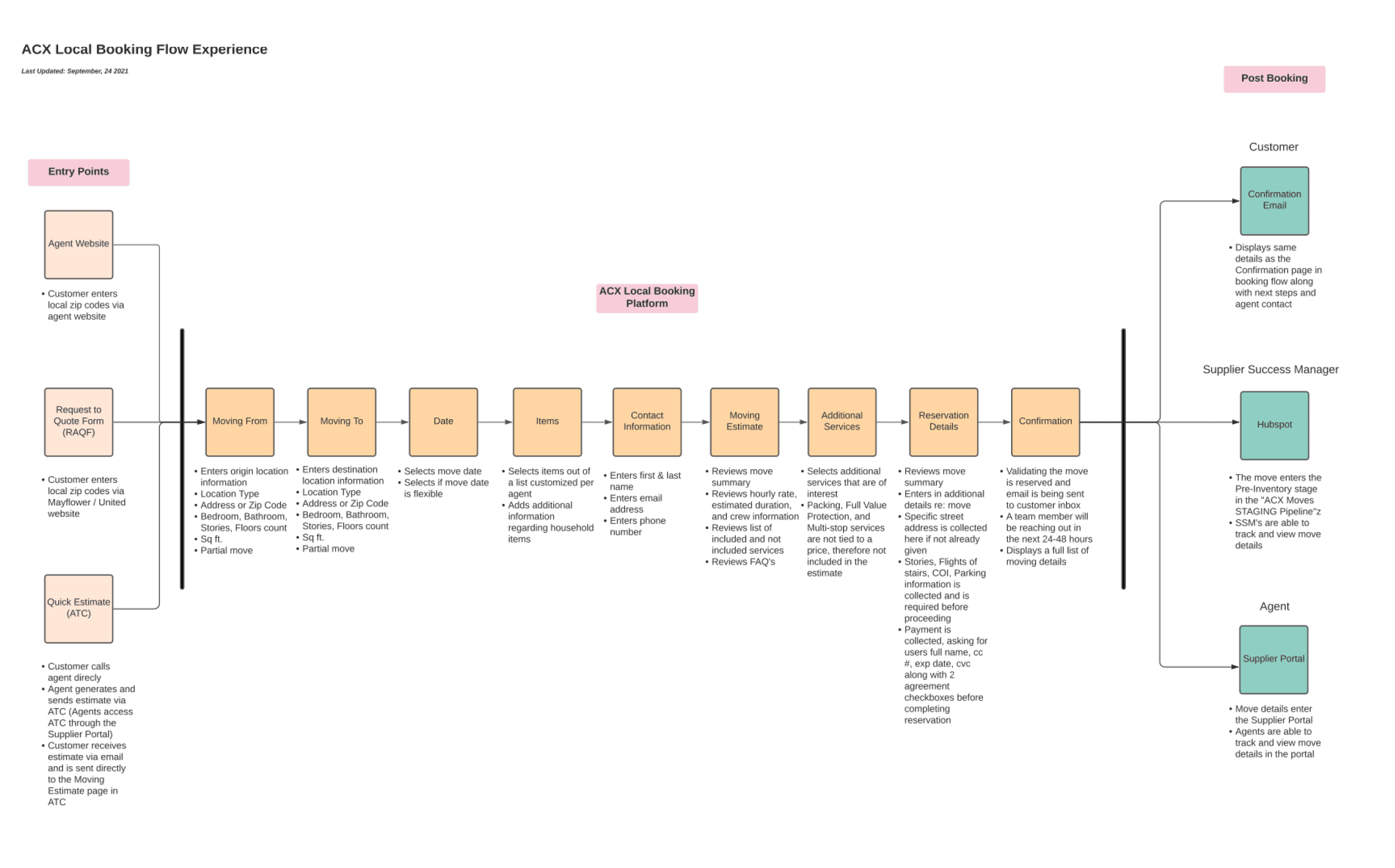


As a customer, I can’t:
Differentiate
We were displaying new information, asking to commit to services, and requiring move and payment information.
Make decisions
The page was asking a lot for our customers to provide amidst a stressful and time sensitive event.
Feel confident
Customers were uncertain why some questions were being asked.
Customers were uncertain why some questions were being asked.
SCOPE
The proposed solution for agents and pricing was to ensure we had accurate info for access, address, and parking. This meant cleaning up the current amount of questions.
For customers, the proposal was to break this full page into more screens. It was risky to add more length to the booking process, but I felt confident that we had to chunk information to beat cognitive load.


OPPORTUNITIES
Less distraction - reduces the noise while also getting closer to an accurate price
Better tracking - by adding more steps into new URL’s, we would have a better chance in the future at narrowing down the problem areas
Checkout approach - gets us closer to a checkout approach that most consumer experiences reflect
CHALLENGES
Ton of moving parts - each input field, whether moving or remove takes some time to clean up
Address accuracy - without credible address verification, we were missing out on a large percentage of moves that could have accurate pricing
*Spoiler alert* Engineering successfully removed/moved input fields and created new pages for the payment section.
The rest of the case study will now be focused on address verification since this is where it gets juicy.
*Spoiler alert* Engineering successfully removed/moved input fields and created new pages for the payment section.
The rest of the case study will now be focused on address verification since this is where it gets juicy.
4. TRADE OFFS
There were three different options when it came down to address verification. Design was responsible for making the decision on which system would best fit our Agent’s needs.
I created a pros and cons for each verification system and shared my findings with the team.
There were three different options when it came down to address verification. Design was responsible for making the decision on which system would best fit our Agent’s needs.
I created a pros and cons for each verification system and shared my findings with the team.
Zip code can dynamically populate city and state
Still need to manually enter rest of the address data
Most affordable
Zip code can dynamically populate city and state
Still need to manually enter rest of the address data
Most affordable
Zip code can dynamically populate city and state
Still need to manually enter rest of the address data
Most affordable
5. DESIGNS
The UX for post entry was too challenging and the cost wasn’t worth the experience. Predictive type ahead had the cleanest UX, but our leads mentioned that it was a bit too pricey. We opted for partial verification.
The benefit of partial verification is that we only need a zip code to price the region of the move. Therefore, in the booking experience, I decided to ask the zip code before receiving a quote and reserve the rest of the address only during payment. That way, we continue to reduce the amount of questions we ask customers.
USER TESTING
Through couple rounds of testing, we found the flow was easy to use and much less overwhelming compared to the current experience. With an 81% success rate, the team felt confident for an MVP.
Through couple rounds of testing, we found the flow was easy to use and much less overwhelming compared to the current experience. With an 81% success rate, the team felt confident for an MVP.


IMPACT
Through couple rounds of testing, we found the new reservation details page was easy to use and much less overwhelming compared to the current experience. With an 81% success rate, the team felt confident for an MVP.
Through couple rounds of testing, we found the new reservation details page was easy to use and much less overwhelming compared to the current experience. With an 81% success rate, the team felt confident for an MVP.
Reduce drop off rate by at least
Reduce drop off rate by at least
1
2
3
9
0
%
1
2
3
9
0
%
1
2
3
9
0
%
Roll out the new experience to all
Roll out the new experience to all
4
5
7
8
9
0
4
5
7
8
9
0
4
5
7
8
9
0
agents
agents
Increase success rate by
Increase success rate by
3
4
5
6
7
8
9
0
%
3
4
5
6
7
8
9
0
%
3
4
5
6
7
8
9
0
%
LESSONS LEARNED
We didn’t fully meet our overall targets for the project, but we were pretty darn close! Either way, this project taught me how to stat flexible when new challenges arise and how to make decisions on when to allocate resources for areas like research.
We didn’t fully meet our overall targets for the project, but we were pretty darn close! Either way, this project taught me how to stat flexible when new challenges arise and how to make decisions on when to allocate resources for areas like research.

